Feature Engineering
Let's divide the train data into x and y now that it has been cleaned and preprocessed.
x_train = train_df.drop(['Survived'], axis=1)
y_train = train_df.Survived
Utility functions
Now I am going to make some utility functions for determining feature importance. How would you measure the importance of a feature? By looking at its correlation coefficient with the target? But that will only capture linear relation!
Instead, look at its Mutual Information score with the target. Mutual Information measures how much the uncertainty about the target is reduced by knowing the value of a feature. It captures both linear and non linear relationships, so it is a much better indicator of feature importance than correlation. Also, a good way of determining which features to use for engineering new features is to see what features have the highest Mutual Information.
I am also going to make functions for finding Permutation Importance and SHAP, I will explain those when they are used.
Finally, I am also making a utility function for scoring a dataset by finding the cross validation scores of the tutorial's RandomForest estimator on that dataset and taking the mean of all cross validation scores. This will be helpful in determing whether a certain action (dropping a feature or adding an engineered feature) is good or not by seeing whether it improves the score or not.
from sklearn.feature_selection import mutual_info_classif
import eli5
from eli5.sklearn import PermutationImportance

from sklearn.model_selection import cross_val_score
from sklearn.ensemble import RandomForestClassifier
import shap

def score_dataset(x, y):
    model = RandomForestClassifier(n_estimators=100, max_depth=5, random_state=1)
    return cross_val_score(model, x, y, scoring="accuracy").mean()

def make_mi_scores(x, y):
    x = x.copy()
    discrete = x.dtypes == int
    return pd.Series(mutual_info_classif(x, y, discrete_features=discrete, random_state=1), index=x.columns).sort_values(ascending=False)

def plot_score(scores):
    scores = scores.sort_values(ascending=True)
    width = np.arange(len(scores))
    ticks = list(scores.index)
    plt.barh(width, scores)
    plt.yticks(width, ticks)
    plt.title("Mutual Information Scores")

def permute_score(x, y):
    model = RandomForestClassifier(n_estimators=100, max_depth=5, random_state=1)
    model.fit(x, y)
    perm = PermutationImportance(model, random_state=1).fit(x, y)
    return eli5.show_weights(perm, feature_names = x.columns.tolist())

def shap_score(model, x):
    explainer = shap.TreeExplainer(model)
    shap_values = explainer.shap_values(x)
    return shap.summary_plot(shap_values[1], x), shap_values
score_dataset(x_train, y_train)

# Output

# 0.8226602222082731
The current dataset has a cross validation score of 0.82266 - this will be our benchmark.
Feature Importance
Let's look at the Mutual Information scores of all the features.
scores = make_mi_scores(x_train, y_train)
plot_score(scores)
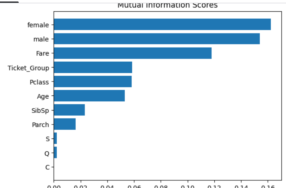
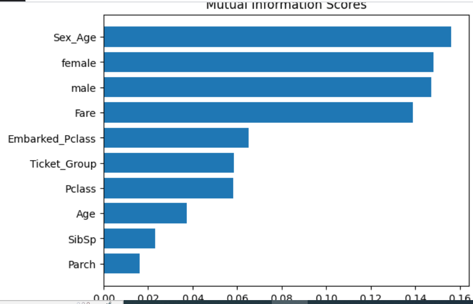
The Sex features have the highest information scores indicating whether a passenger is male or female affects survivability the most - we saw this in the tutorial, with most females surviving and most males dying.
The Embarked features have the lowest information scores by far, indicating the survivability of a passenger has very little to do with where the passenger boarded the ship.
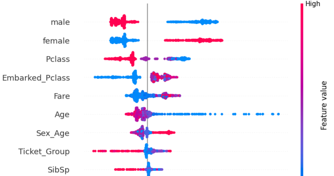
We have seen how much the various features affect the target, but how do they affect the target? Does increase in a certain feature increase survivability or decrease it? Now we will look at the SHAP plot which measures how the increase in a certain feature affected the target and by how much. We will do this for all features and all samples.
SHAP plots provide a lot of information because rather than providing a simple aggregate numerical score, they display the plot for all samples separately. If you can interpret a SHAP plot well, you will get a lot of comprehensive understanding of the dataset and the model used to train on it.
test_model = RandomForestClassifier(n_estimators=100, max_depth=5, random_state=1)
test_model.fit(x_train, y_train)
plot, scores = shap_score(test_model, x_train)
plot
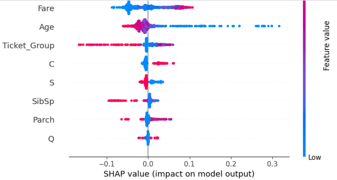
Each dot in the plot is a sample. Red dots have high value of the feature and blue dots have low value of the feature. Dots lying to the right of the line in the middle indicate the value of the feature increased its probability of being in the given class ('1' in this case, as in 'survived'). The opposite is true for dots on the left of the line.
The female and male features are very easy to interpret. A passenger being female (red dots for female and blue dots for male) always increases survivability, while a passenger being male (red dots for male and blue dots for female) always decreases survivability.
Other features can be interpreted in the same manner (try it yourself as an exercise!).
At the bottom of the plot is the feature Q, meaning it affects the prediction the least. A passenger not being from Queenstown (blue dots) does not affect survivability at all with all blue dots being clustered in the middle, while a passenger being from Queenstown affects survivabiliy slightly in both directions for different samples. All this indicates the feature is uninformative at best and confusing at worst. Drop it.
The feature C has the lowest Mutual Information score - completely 0, indicating it has absolutely no relation to the target. Drop it as well.
x_train.drop(['C', 'Q'], axis=1, inplace=True)
test_df.drop(['C', 'Q'], axis=1, inplace=True)
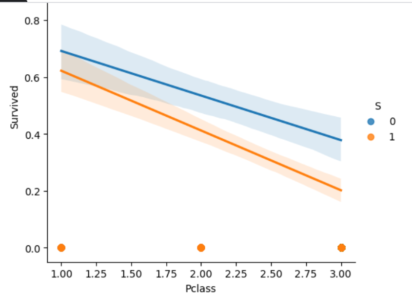
S doesn't have good Mutual Information score either but from the SHAP plot we can see it does affect prediction slightly - all people embarking from Southampton have slightly reduced survivability and the opposite for those not embarking from Southampton.
Let's see if we can combine S with another feature to form a meaningful aggregate and replace S with it. We can see S does have a feature interation with Pclass.
sns.lmplot(train_df, x='Pclass', y='Survived', hue='S')
Clustering
I am going to form clusters of passengers based on what Pclass they are and whether they embarked at Southampton or not. Thus, there will be 6 clusters: 3 possibilities for Pclass and 2 possibilities for S. Replace S with this feature of clustering.
Do the same for Sex features with Age: recall that we did actuall have a feature - Honorific - which indicated both gender and age, but I dropped it. Now form 6 clusters out of male, female and Age - 2 possibilities for gender and age divided into 3 age ranges. Hopefully this will be more informative than Honorific that only had two age ranges for each gender.
from sklearn.cluster import KMeans

x_temp_1 = x_train.loc[:, ['male', 'female', 'Age']]
x_temp_1.Age = (x_temp_1.Age - x_temp_1.Age.min()) / (x_temp_1.Age.max() - x_temp_1.Age.min())
kmeans_1 = KMeans(n_clusters=6, n_init=6, random_state=1)
x_temp_1["Sex_Age"] = kmeans_1.fit_predict(x_temp_1)

x_temp_2 = x_train.loc[:, ['Pclass', 'S']]
kmeans_2 = KMeans(n_clusters=6, n_init=6, random_state=1)
x_temp_2["Embarked_Pclass"] = kmeans_2.fit_predict(x_temp_2)

x_temp = x_train.copy()
x_temp = x_temp.join([x_temp_1.Sex_Age, x_temp_2.Embarked_Pclass])

x_temp.drop(['S'], axis=1, inplace=True)
score_dataset(x_temp, y_train)

# Output

# 0.8249262444291006
The cross validation score went up to 0.8249 meaning the feature engineering we did was meaningful. Do this for the real data
x_train = x_train.join([x_temp_1.Sex_Age, x_temp_2.Embarked_Pclass])
x_train.drop(['S'], axis=1, inplace=True)

test_temp_1 = test_df.loc[:, ['male', 'female', 'Age']]
test_temp_1.Age = (test_temp_1.Age - test_temp_1.Age.min()) / (test_temp_1.Age.max() - test_temp_1.Age.min())
kmeans_1 = KMeans(n_clusters=6, n_init=6, random_state=1)
test_temp_1["Sex_Age"] = kmeans_1.fit_predict(test_temp_1)

test_temp_2 = test_df.loc[:, ['Pclass', 'S']]
kmeans_2 = KMeans(n_clusters=6, n_init=6, random_state=1)
test_temp_2["Embarked_Pclass"] = kmeans_2.fit_predict(test_temp_2)

test_df = test_df.join([test_temp_1.Sex_Age, test_temp_2.Embarked_Pclass])
test_df.drop(['S'], axis=1, inplace=True)
PCA
There is another kind of feature engineering that can be done - with Principal Component Analysis. For this, take the features with the highest correlation with the target and decompose that correlation into principal components. Either add the principal components themselves to the dataset or enginner new features from combining the original features by looking at their loadings.
from sklearn.decomposition import PCA

def apply_pca(x):
    x = (x - x.mean(axis=0)) / x.std(axis=0)
    pca = PCA()
    x_pca = pd.DataFrame(pca.fit_transform(x), columns=pca.get_feature_names_out(), index=x.index)
    loadings = pd.DataFrame(pca.components_.T, columns=pca.get_feature_names_out(), index=x.columns)
    return pca, x_pca, loadings

def plot_variance(pca):
    plt.figure(figsize=(4, 4))
    grid = np.arange(1, pca.n_components_ + 1)
    evr = pca.explained_variance_ratio_
    plt.bar(grid, evr)
    plt.xlabel('Components')
    plt.ylabel('Variance')
    plt.title('Explained Variance')

train_temp = x_train.join(y_train)
train_temp.corrwith(train_temp.Survived).sort_values(ascending=False)[1:]

# Output

# female             0.543351
# Fare               0.257307
# Embarked_Pclass    0.214660
# Sex_Age            0.173384
# Parch              0.081629
# Ticket_Group       0.064962
# SibSp             -0.035322
# Age               -0.089284
# Pclass            -0.338481
# male              -0.543351
Unfortunately, in this case the only features with significant correlation with the target are female and male, both of which are in fact a single feature. Still, let's see if the PCA of female, Pclass and Fare do anything meaningful.
features = ['female', 'Pclass', 'Fare']
x_temp = train_temp.loc[:, features]
pca, x_pca, loadings = apply_pca(x_temp)
loadings

# Output

#           pca0	    pca1	    pca2
# female	0.333941	-0.939981	-0.070131
# Pclass	-0.659326	-0.286110	0.695291
# Fare	    0.673626	0.185947	0.715298
plot_variance(pca)
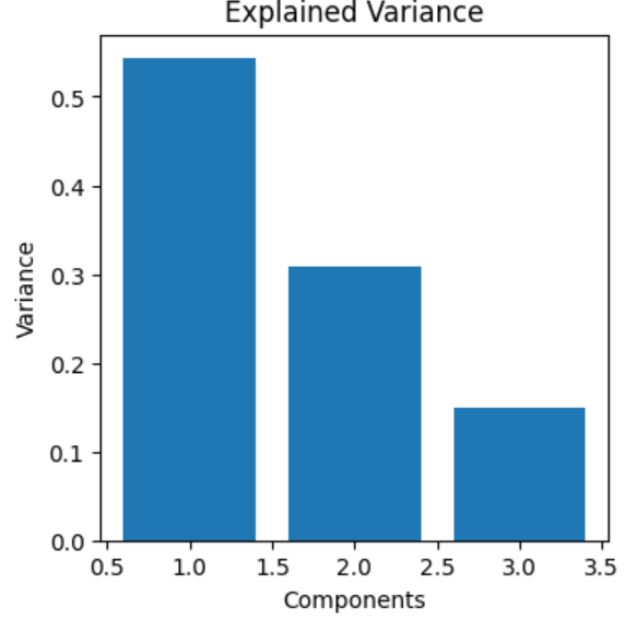
The first principal component gives only around 55% information which isn't enough to justify enginnering new features with PCA.
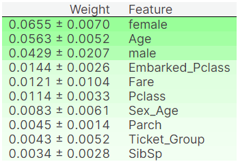
Results
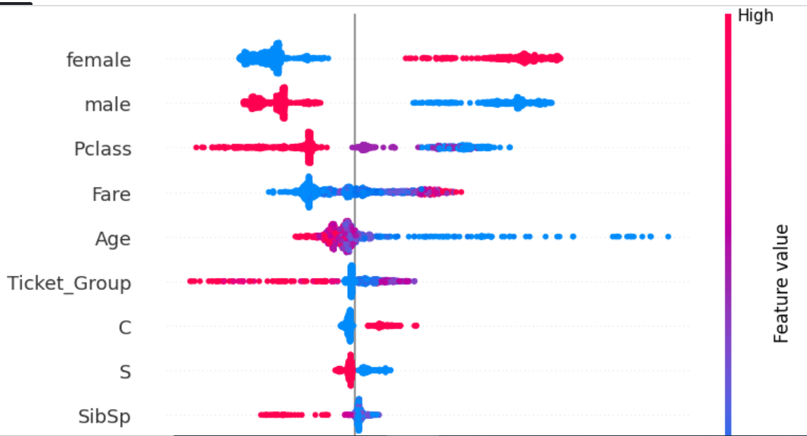
Our feature enginnering is done. Let's look at the scores of our final features.
scores = make_mi_scores(x_train, y_train)
plot_score(scores)
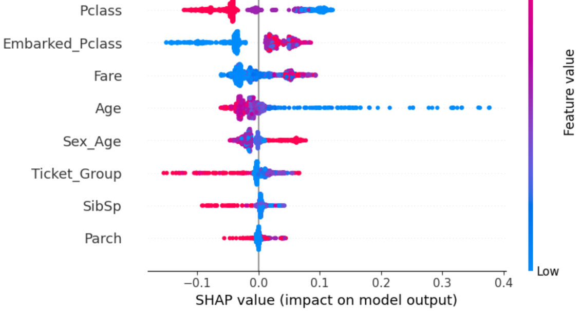
Permutation Importance is another way of interpreting how different features affect prediction, given a model. The Permutaion Importance of a feature measures how much the prediction accuracy is affected upon randomly shuffling the values of that feature. The more negatively prediction is affected upon random reshuffle, the more it is impacted by the feature.
Sometimes Permutaion Importance score may be negative. This means randomly reshuffling the feature actually increased the accuracy instead of decreasing it. Fortunately this isn't the case with any of my features.
permute_score(x_train, y_train)
test_model = RandomForestClassifier(n_estimators=100, max_depth=5, random_state=1)
test_model.fit(x_train, y_train)
plot, scores = shap_score(test_model, x_train)
plot